UNISYS U-LEAF
The Unisys Law Enforcement Application Framework (U-LEAF) gives resource-challenged law enforcement personnel a tool to help them meet the growing public demand for effective investigations of crime and terror threats.
The Unisys Law Enforcement Application Framework (U-LEAF) gives resource-challenged law enforcement personnel a tool to help them meet the growing public demand for effective investigations of crime and terror threats.
To comply with my confidentiality agreement I have omitted and appropriated confidential information. These designs are a reinterpretation of the original.
To comply with my confidentiality agreement I have omitted and appropriated confidential information. These designs are a reinterpretation of the original.
Objective
Recognising that the user experience is not optimal for its expanded audience, Unisys wanted to improve the user interface (UI) and user experience (UX) of the U-LEAF application with an eye on future changes such as making the application responsive and increase satisfaction and performance in current users and to create a more effective sales tool for target customers.
- Deliver an optimal user experience for current U-LEAF users which ensures that information can be inputted, accessed and processed effectively, increasing efficiency for end-users.
- Provide a new interface design which delivers a stronger visual impact during the sales process, ultimately contributing to an increase in new U-LEAF customer
- Understanding of U-LEAF end-user needs and behaviors in relation to the platform, discovering where there are gaps to innovate within or pain points to resolve.
- Design a new landing/dashboard page and navigation which is clear, easy to use and functional, as well as visually appealing.
- Provide a landing page/dashboard interface that delivers more value and functionality by making the system tools available to users, transforming the dashboard into an active, rather than a passive interface.
- Work closely with the U-LEAF product and development teams to ensure that design recommendations can be efficiently implemented.
Recognising that the user experience is not optimal for its expanded audience, Unisys wanted to improve the user interface (UI) and user experience (UX) of the U-LEAF application with an eye on future changes such as making the application responsive and increase satisfaction and performance in current users and to create a more effective sales tool for target customers.
Additionally, U-LEAF needed to have a pattern library or set of design guidelines that could be used to make changes in the future, so U-LEAF can maintain the new experience as the product evolves.
In addition, U-LEAF should be is easier for end-users to learn how to use the application. Ultimately the long term goal will be to have a proven and evidence-based rationale that has driven the structure, language, and design of the interactions.
Following were prime goals:
- Evaluating and testing the current UI
- Understanding user behavior
- Determining how the new UX can be applied throughout the rest of the application
- Design patterns and best practice guidance that will enable Unisys to take the remaining design work forward in-house consistently and to a high standard
My Role
By leading the UX Design team for U-LEAF, I was involved in the following tasks/deliverables
- A background review of existing information
- Stakeholder requirements workshops
- User testing and interviews in various phases of the project either telephonic or face-to-face.
- Online audience survey
- Strategy workshops
- Task Flows, Lo-Fi Sketches
- Ideation & Prototyping workshops
- Style Guide / GEL
- Graphic design & testing
- A background review of existing information
- Stakeholder requirements workshop
- User testing and interviews (telephonic & face-to-face)
- Online audience survey
- Strategy workshops
- Task Flows, Lo-Fi Sketches
- Ideation & Prototyping workshop
- Wireframes & Wireframe testing with selected user groups
- UX Pattern Library
- Graphic design & testing
Challenges
- Getting user research into agile teams in a way that is timely, relevant and actionable was a challenge
- Identifying and arranging to test with users, often with a very niche skill-set and limited availability made initial research and validation problematic.
- ULEAF users at all levels have a vested interest to help inform and improve the product and see the potential in their involvement as they too benefit from any improved product or service through ULEAF UX improvement initiatives.
- Given the rich nature of the ULEAF interface, usability was paramount to the design approach – the ULEAF application itself is powerful, flexible and the reporting highly scalable, so the designs needed to cater for the diverse information that can be accessed through the interface while remaining intuitive and relevant.
The Team
I led the User Experience Team responsible for Product Design – User Experience and Interface – of this project from June 2012 - June 2014 and collaborated with a Product Owner, Product Delivery Manager and Product Marketing and Research.
Main Tasks
- Manage remote user analysis
- Persona creation
- Building the Project Vision
- Iterative UX design
- Low and High Fidelity Prototyping
- Design Execution and validation
- UX Pattern Library (Style Guide)/ Best Practice Guidelines
- Provide UX expertise throughout the design & implementation phase
Core Team
Shilpi Kumar as Product Manager, Steve Potter as Solution Architect, Julie Hirani as Dev Team Lead, Iyer Srinanth as Product Owner and Marketing Head, Shailla Philip and QA Manager, Phil Storer as UX Developer and Product Configuration Lead and Bhanu Akkineni, Subramanyam Periya Samy, Ganesh Sivaramakrishnan, Pragun Mehta & Kethu Raj as Developers and John Abikonte as DB Administrator and OFFSHORE Delivery Team of more than 20 Developers.
- Getting user research into agile teams in a way that is timely, relevant and actionable was a challenge
- Identifying and arranging to test with users, often with a very niche skill-set and limited availability made initial research and validation problematic.
- ULEAF users at all levels have a vested interest to help inform and improve the product and see the potential in their involvement as they too benefit from any improved product or service through ULEAF UX improvement initiatives.
- Given the rich nature of the ULEAF interface, usability was paramount to the design approach – the ULEAF application itself is powerful, flexible and the reporting highly scalable, so the designs needed to cater for the diverse information that can be accessed through the interface while remaining intuitive and relevant.
Design & Research Tool Kit
Design & Research Tool Kit

Approach
Approach
The below diagram summarises the iterative approach which we have taken for this design project.
Only if we have a full understanding of project needs, objectives, and any conditions and constraints that are operating on the development of the application can we can deliver with the full value.
With a number of user research activities followed by ideation and wireframing. This given U-LEAF information, insight and recommendations to drive immediate improvements, as well as information to guide and shape longer-term initiatives.
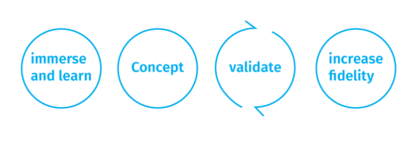
By agreeing with the above core approach to design, but allowing for flexibility within the precise activities at each stage, we were able to collaborate effectively with the stakeholders and achieve effective outputs.
Project kick-off
Project kick-off
We began with a kick-off meeting (face-to-face) U-LEAF stakeholders and this gave us the opportunity to fully understand the objectives/priorities and to agree with the focus for the project.
- During this meeting, we agreed upon U-LEAF project team roles and responsibilities.
- Discussed objectives in full and agreed priority.
- Agreed on a plan for the immersion phase and responsibility for scheduling of briefing sessions.
- Agreed on a plan for involving end-user insight in order to drive the design process.
- Discuss any deadlines and milestone dates.
- Agree on a final approach for the project, enabling the project manager to create a more accurate scope of precise activities and a project plan.
Deliverables
- Project plan.
- Documented scope for the immersion phase and any further user research phases and signed ahead of the immersion phase commencement.
- Documented actions where the UXD team must schedule experts or user inputs for later phases.
Immerse and learn phase
The following kick-off and upon sign off of the project scope, an immersion phase commenced. The aim of this activity is for the UX Research team to gain an understanding of the different types of end-users.
Ideally, we conduct a combination of the following activities:
U-LEAF walk-throughs
We run a series of walk-through sessions with U-LEAF experts who have a variety of roles. This allowed us to understand the system from a variety of perspectives, for example:
- Product owners – enabling us to gain a detailed understanding of the way that the system has been designed
- Developers – enabling us to uncover technical limitations/opportunities.
- Trainers and/or help center staff – enabling us to probe on the different types of existing users and the pain points that they experience.
- Sales reps – enabling us to understand target customers, the feedback that is received and how the system is marketed.
Stakeholder workshops
In order to dig into further detail after the walk-through sessions, and to ensure that we gain all necessary stakeholder input on priorities, we spoke to individual stakeholders in more detail.
This workshop provided U-LEAF UX team an opportunity to consider the challenges identified in the current U-LEAF platform and to focus on key areas for improvement and to generate, critique, and refine ideas and possible solutions in a structured and facilitated way and transform U-LEAF into one of the most successful software product.
The point was to equip the developers, in particular, with a clear, shared view of what they are working on, how to apply our subsequent design guidance, and how to choose viable solutions.
Heuristic’ Evaluation
Expert ‘heuristic’ evaluation of the U-LEAF interface conducted by UXD team to identify areas of improvement relating to information architecture, simplicity, and appropriateness of core user journeys, the strength of interactive elements and calls to action, and other core usability or user experience considerations and created an action-oriented report with findings and prioritized recommendations.
Expert ‘heuristic’ evaluation of the U-LEAF interface identifying areas of improvement and recommendations relating to Information Architecture, simplicity, and appropriateness of core user journeys, strength of interactive elements and calls to action, and other core usability or user experience considerations.
- A basic system walkthrough with a product owner and familiarization
- Expert user interface review
- Creation of an action-oriented report with findings and prioritized recommendations
- Presentation of the findings and recommendations
User Testing of ULEAF Interface
To understand context-of-use, what works well, and where there is room for improvement, U-LEAF UXD team in collaboration with Dorset Police conducted a three-day interview and usability evaluation sessions of the U-LEAF system either at UNISYS testing facility.
We have conducted task-based, observational user testing and the study guided users through a number of interview questions to capture their thoughts and feelings, along with a walkthrough of their common tasks on the system. This allowed our design team to observe pain points, the areas that work well, and users’ thoughts and workarounds.
We were able to recreate a typical desk setup by recreating a Major Incident Room for our study.
Objective
Understanding context-of-use, what works well, and where there is room for improvement
- In collaboration with Dorset Police and Unisys ULEAF Design team, conducted a three-day interview and usability evaluation of the ULEAF system either at UNISYS Premises or on customer sites
- We have conducted task-based, observational user testing
- The study guided users through a number of interview questions to capture their thoughts and feelings, along with a walkthrough of their common tasks on the system. This allowed our design consultants to observe pain points, the areas that work well, and users’ thoughts and workarounds.
- We were able to recreate a typical desk setup for our study, in a Major Incident Room
User Interviews
User Interviews
To build a broader and richer picture of user preferences, challenges, and expectations we conducted user interviews with 8 users. This approach worked particularly well to supplement the expert review and the interviews conducted at the customer site.
- To build a broader and richer picture of user preferences, challenges, and expectations with 6-8 users.
- This approach worked particularly well to supplement the expert review
- Interviews conducted either at Unisys and customer sites and remotely by phone.
The design challenge we focused on was “being lost”
“This is probably the most important challenge. This is compounded by the different options, screens, data fields, etc. (INCONSISTENCY!)”
Andy, U-LEAF user
Context 1
Observation
Early in an investigation, People can struggle to enter data quickly and accurately, to match the pace of the investigation, when there is a lot of pressure, and when police and associated support staff are operating in “fast time”
How might we make it quicker and more straightforward to enter key data so that we can avoid added stress and frustration, reduce the risk of error, and fit in with common workflows
Context 2
Observation
People can easily get lost, run into errors, and feel anxious while having to perform unfamiliar or infrequent activities.
How might we make it easy for a user to smoothly perform less familiar actions so that they don’t feel lost, frustrated, or unsure, and don’t need to ask for help
Context 3
User is in the midst of intensive data entry work
Observation
Some users are unsure of where they are, how they can get “back”, or what else they can do here. In addition, within a given interface, it may not be clear what to enter or what to click on without “just knowing”
How might we make it clear where a user is, where they have come from, the progress of their task(s), and what they can do next so that the application seems more “intuitive”, and the user can more quickly become confident and familiar with it?
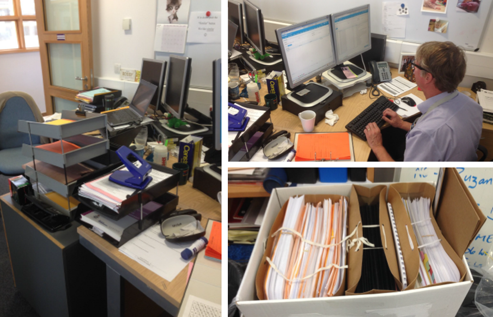
ULEAF Context - A typical day of ULEAF User. User desk, Documents handles as part of the investigation, Exhibits, etc...
Rating the application
Using System Usability Score (SUS), which provides an industry standard for measuring the usability of systems, help us rate the U-LEAF application. Users answered 10 questions in an unmoderated setting and it gives us a useful benchmark for later comparison. U-LEAF scored 70 out of 100 which indicates it is a usable system but required drastic improvements of user experience.
- We used the System Usability Score (SUS) to help us rate the ULEAF application
- SUS provides an industry standard for measuring the usability of systems
- Users answer 10 questions in an unmoderated setting
- It gives us a useful benchmark for later comparison
- Scored out of 100 with 70 or higher indicating a usable system
Findings
Some of the key points of frustration:
● The time it can take to log in, and having to logout and back in again, to see updates.
● The blandness of the interface makes things hard to distinguish.
● Losing work when closing windows.
● Poor error handling.
● Not being able to save preferences (e.g. table column order)
Possible opportunities?
● Consider allowing systems to “talk to each other” e.g. Niche and Holmes
● Allow users to use barcode scanners to speed up how they deal with e.g. exhibits.
Key points of frustration
● The time it can take to log in, and having to logout and back in again, to see updates
● The blandness of the interface makes things hard to distinguish
● Losing work when closing windows
● Poor error handling
● Not being able to save preferences (e.g. table column order)
Context 1
Observation
Early in an investigation, People can struggle to enter data quickly and accurately, to match the pace of the investigation, when there is a lot of pressure, and when police and associated support staff are operating in “fast time”
How might we make it quicker and more straightforward to enter key data so that we can avoid added stress and frustration, reduce the risk of error, and fit in with common workflows
Context 2
Observation
People can easily get lost, run into errors, and feel anxious while Having to perform unfamiliar or infrequent activities
How might we make it easy for a user to smoothly perform less familiar actions so that they don’t feel lost, frustrated, or unsure, and don’t need to ask for help
Context 3
User is in the midst of intensive data entry work
Observation
Some users are unsure of where they are, how they can get “back”, or what else they can do here. In addition, within a given interface, it may not be clear what to enter or what to click on without “just knowing”
How might we make it clear where a user is, where they have come from, the progress of their task(s), and what they can do next so that the application seems more “intuitive”, and the user can more quickly become confident and familiar with it.
Driven by the understanding gained during from the immersion phase (of the U-LEAF platform, its users, stakeholder priorities and our expert opinion on the areas which have the most potential for business/user impact) UX team made a recommendation on the focus for the remaining design activities. This is been agreed in an updated scope document, which made clear the precise areas of the U-LEAF platform which need to re-designed. This scoping document also made clear any other elements of the platform which needed to be included.
Design Concepts
We, the UX team, then began to visualize our ideas for the re-design of
the agreed U-LEAF elements, whilst keeping the full system in mind for re-usable elements and future development. The designers ensured to design with a responsive layout (for tablet/mobile) in mind, ensuring that the system is as future-proofed as possible.
Primary user personas
Primary personas were created to provide added insights into the various user demographics such as age, background and the main user-tasks of the people who will be using the system. By specifying user goals, behaviors and must-have features this helps to keep the overall user experience targeted to these users and solving real user needs.
Secondary personas
With the secondary personas, I tried to think outside of the box (e.g. Missing person reporting, bomb squad, previous Police field experience, etc.) as I thought it would generate more creative ideas and ultimately a better user interface. This is a great way to think about how to enhance the current user experience and add some nice-to-have features.
Ideation & Prototyping workshop
The next step in the process was to run Ideation & Prototyping workshops attended by all key decision-makers, but also developers who
can input on technical feasibility and ease of implementation, where we have generated design ideas and concepts and worked into low-fidelity prototypes suitable for testing and further developments. Co-design prototyping workshop enabled us to take those initial ideas to help determine how the design principles should be applied to the rest of the application with new user journeys and new design standards.

In the end, a low fidelity prototype developed, that includes elements such as working navigation and clickable functional areas which links together the concepts into journeys which were been used for validation research.
This prototype used as part of the specification for the new UI, which allowed users to click-through the new visuals during any subsequent testing and as a means to gather general feedback on the designs and approach with a wider stakeholder group.
Co-design workshops drastically shortened the overall solution design process by bringing key stakeholders together to define and review the approach to designing the product with one another, and with the technical and development teams responsible for building it.
We feed in the knowledge gained from user engagement exercises and all previous design work, to create a user-centric solution that meets business objectives and technically implemented in an efficient way.
This process has proven to enhance active participation from all parties and seriously expedite the development and improved the overall quality of the product.
Ideation and prototyping workshop were over two full days and in addition to design ideas, we were focusing on flow and user journeys, and on how system elements and screens work consistently and cohesively to provide an optimal user experience.
Progression to a higher fidelity
We then explored how new concepts will look and work for users
including the visual styling and brand application. This was the
opportunity for us to use our cross-sector experience to design a visually
compelling interface which differentiates from other B2B systems. At this stage have involved U-LEAF developers enabling collaboration throughout the higher fidelity design phase through a series
of design and build sprints ensures that technical feasibility is constantly assessed, but also means that the developer was able to begin making recommended changes straight into the build of the system.
This created time/cost efficiencies, as the designer was able to focus on the more complex, bespoke design elements which required visualisation and stakeholder improvement whilst the developer applied agreed styles and changes to the platform itself.
Working alongside the developers and ensuring that they understood
our customer-centered process was crucial to the success of this project, as they understood the need for change and the drive for a simple and intuitive user interface.
Frequent checkpoint calls or meetings held with wider U-LEAF stakeholders within the time available to share progress and signed off the work that is being completed.
New designs for key UI screens
the key area of focus for the UI redesign was the landing or home page for the application, which acted as a launchpad for the user journey through the rest of the application.
Created a couple of early concept designs for the landing page and for the personal data screen that, through an iterative and collaborative approach, set the tone for the remaining design work for the rest of the application.
Development of style guide / GEL and design patterns:
Following the workshop, we produced a style guide or GEL (Global Experience Language) design document - a mini site in its own right which outlined design patterns, user journeys and interactive elements which cannot be easily be captured in the prototype, and which taken forward by the design and development teams later.
This online guidance featured interaction design principles, design patterns and standards, and also included code snippets so the principles were easily implemented by the technical team.
Ideation & Prototyping workshop
The next step in the process was to run Ideation & Prototyping workshops with ULEAFs key stakeholders where we have generated design ideas and concepts and worked into prototypes suitable for testing and further developments. Co-design prototyping workshop enabled us to take those initial designs to help determine how the design principles should be applied to the rest of the application with new user journeys and new design standards.
Co-design workshops drastically shortened the overall solution design process by bringing key stakeholders and users together to define and review the approach to designing the product with one another, and with the technical and development teams responsible for building it.
We feed in the knowledge gained from user engagement exercises and all previous design work, to create a user-centric solution that meets business objectives and technically implemented in an efficient way.
This process has proven to enhance user participation, seriously expedite the development and improved the overall quality of the product.
Ideation and prototyping workshop were over two full days focusing on flow and user journeys, and on how system elements and screens work consistently and cohesively to provide an optimal user experience. Along with me, UI Designer was present to facilitate the session along with product owner Steve Potter to document it and create the prototype.
The core deliverable from the workshop was an interactive prototype that includes elements such as working navigation and clickable functional areas. This prototype used as part of the specification for the new UI, which allowed users to click-through the new visuals during any subsequent testing and as a means to gather general feedback on the designs and approach with a wider stakeholder group.
New designs for key UI screens
the key area of focus for the UI redesign is the landing or home page for the application, which will act as a launchpad for the user journey through the rest of the application.
Created a couple of early concept designs for the landing page and for the personal data screen that, through an iterative and collaborative approach, set the tone for the remaining design work for the rest of the application.
Development of style guide / GEL and design patterns:
Following the workshop, we produced a style guide or GEL (Global Experience Language) design document - a mini site in its own right which outlined design patterns, user journeys and interactive elements which cannot be easily be captured in the prototype, and which taken forward by the design and development teams later.
This online guidance featured interaction design principles, design patterns and standards, and also included code snippets so the principles were easily implemented by the technical team.
Deliverables
Deliverables
- Provided user experience expertise throughout the design phase
manage remote user analysis - Persona creation
- Iterative Creatives / UX design
- Rapid prototyping
- UX Pattern Library (Style Guide)/ Best Practice Guidelines: which provide key design principles used for reference in future development cycles.
Result
- Dramatically improved usability, enhance functionality and ensure the system was far more effectively adopted by the ULEAF Users.
- Feedback on the new version of ULEAF has been excellent and we are delighted that the application scored 89.6% on the System Usability Scale (SUS) independently tested by Usability experts Sigma Consulting.
- In Addition, We did build up a good understanding of the challenges, culture, and drivers involved in working with law enforcement agencies.
Selected Works

HMRC - CDS ReimbursementsWEB APPLICATION

DWP - Disputes Modernisation ProgrammeProject type

ESFAProject type

DfT BSOGProject type

National Careers ServiceProject type
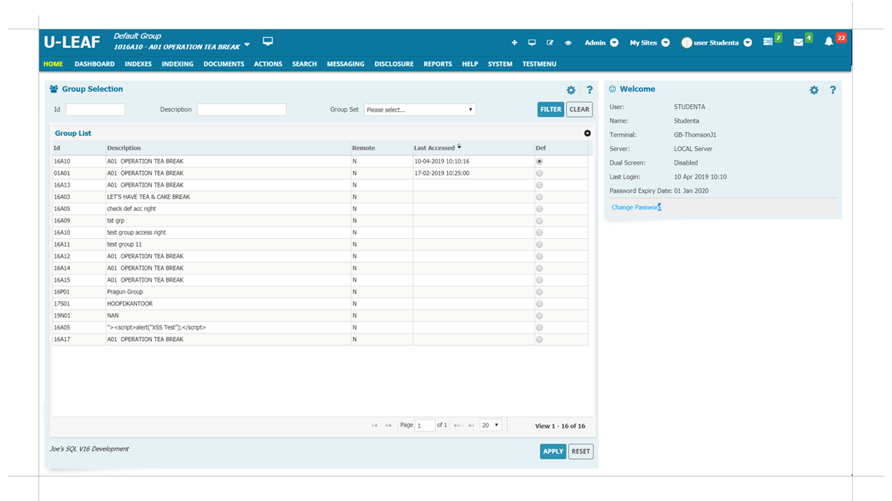
ULEAFWEB APPLICATION
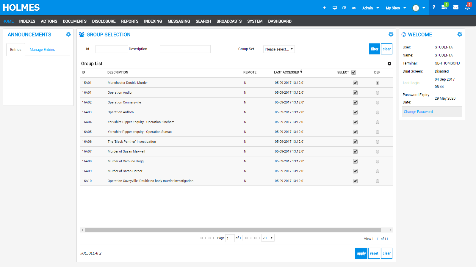
HOLMES2WEB APPLICATION
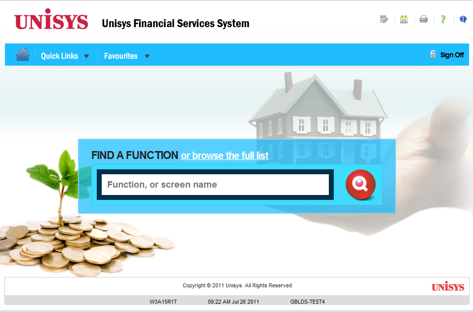
UNISYS-UFSSWEB APPLICATION
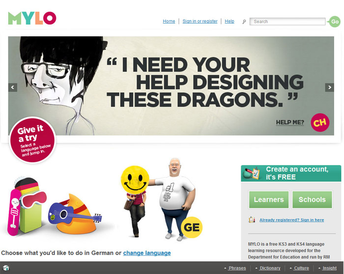
MYLOWEB APPLICATION

DUTCH-CUSTODIALWEB APPLICATION
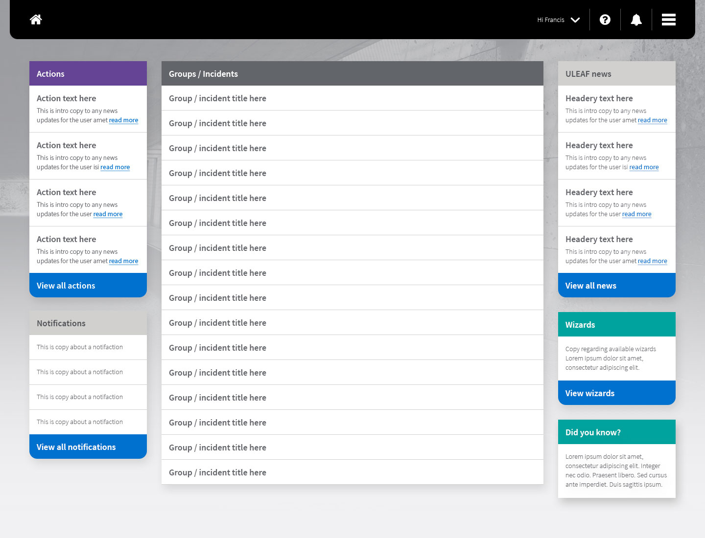
Digital InvestigatorWEB APPLICATION
SONY-TAGPLAY STATION TAGGING GAME
nokia-nfcNOKIA NFC

asiaroomsASIAROOMS

calderdale-collegeCalderdale College
© Jojest Thomson 2019 - Forever
